
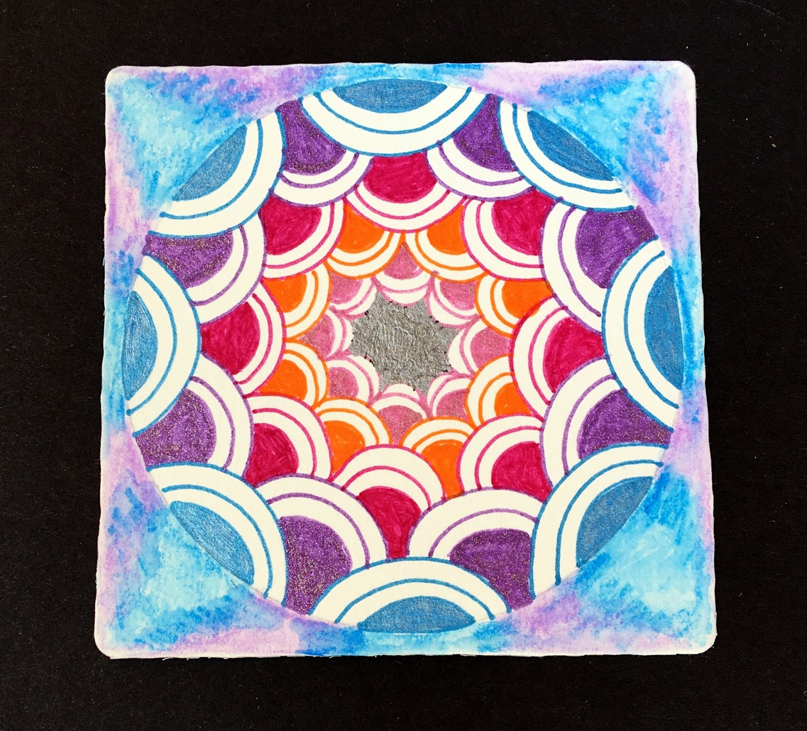
For my 1st tile, I used a monostring (LOL-is there such a thing?), just a circle that I tangled inside with different color pens. When I was done, it looked so plain that I decided to add a colored pencil wash to the outside. I am not quite sure if I like this one or not. For the 2nd tile, I used a more traditional string and added Crescent Moon in a couple of different ways. One of the things I really liked, was just adding the Crescent Moon to the string, every other way, on each side.....very fun tangleation!
Both tiles are so beautiful! I love the color in the first because it sets off the crescent moon to perfection. I always love the depth and values in black and white and your string gives the tile flair!
ReplyDeleteI love what you did with the colour and shading in the first piece. The depth is amazing.
ReplyDeleteBeautiful tiles, both.
ReplyDeleteI love your Crescent Moon. The simplicity is wonderful.
ReplyDeleteLove the use of color in the first tile, and I really like how the
ReplyDelete2nd one flows on the tile.
I love your tangellations!
ReplyDeleteI love your tangellations!
ReplyDeleteI love your tangellations!
ReplyDeleteBoth of your tiles turned out great! I love the color in the first one! It's so pretty! Great job on the challenge. :)
ReplyDeleteVery nice compositions. The first reminds me oa a kelidescope and the second has an interesting string formation.
ReplyDeleteThe 1st one really caight my attention, drew my eyes right in!
ReplyDeleteYour first is lovely but who can resist the frog in the second tile?
ReplyDeleteTwo beautiful pieces. Love the color of the first and the creative design of the second!
ReplyDeleteWow, I love the colors in the first tile and the composition of the second. Really pretty.
ReplyDeleteha, ha, your second one does sort of look like a frog - now that I've read that comment, that's all I can see (of course, it's a beautiful fun frog!). Love the depth you've achieved with color, and the great strong simple lines of the first.
ReplyDeleteThey both are very lovely and also so very different.
ReplyDeleteI love the combination of colors in the first one.